Sunday, April 6, 2014

WIP #4

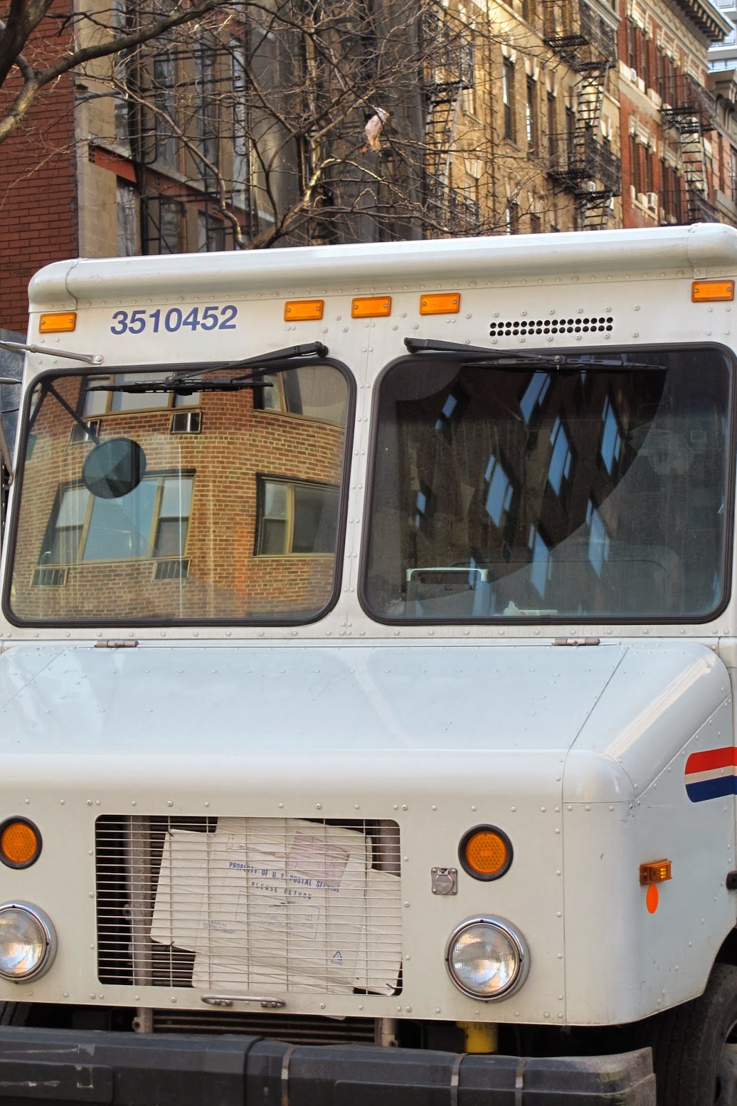
Before taking these photos I went back and studied my old contact sheets to determine which photos where working well together as a series.  I decided that I wanted this set of photos to focus on the reflection.  In the past I have had photos where the image being reflected was included in the photo and was just as crisp as the image being reflected.  With this project I set out to take a series of photos, which only showed one possible perspective, which would be demonstrated threw the images only focusing on the reflections.
I choose these photos because I felt like they force the viewer to look at the photo with a clear single perspective in mind.  Previously the viewer had the option to look at the image, which would be doing the reflecting and its reflection.  I choose the photo of the word dyslexic because I wanted to show my view of the word dyslexic.  I do not see dyslexia as seeing things backwards or incorrectly, I just see it as a different way of viewing something.  I hung a photo of the word backwards and upside down and took a photo of its reflection.  I did this because I want my viewers to see that when I see the world, “it is not backwards”.  I wanted to get the idea across that there is no one correct way to see the world.  I included photos that were only of reflections, and images where the object being reflected was included but taken with a shallow depth of field. 
            I printed this series of photos on a larger scale than in the past.  I did this because I feel that if the images are larger, and closer to their actual size, the viewer is able to see the details in the photo and possibly understand it better.  I also created a white border, which is equal on all sides because I feel like uneven boarders are distracting.  I also believe that having a boarder and not a bleed image makes the viewer focus on the image being presented and not wonder about what lays beyond the edge of the image.  Reflections hold a lot of detail but can also be distorted and having them displayed on a larger scale it makes the images easier to view.  


Monday, March 31, 2014

Feedly Reader Response #11


After I made my post to the Photo exchange website (http://photographyexchange.wordpress.com/2014/03/27/lucy-nystrom/ ) I explored a lot of other students work.  I looked at http://photographyexchange.wordpress.com/2012/04/07/abie-lauren-kanyuck/ and http://photographyexchange.wordpress.com/2014/03/18/fengyu-lloyd-wang/.  I looked for other images, which focused on reflections and read the comments left by others. My favorite was http://photographyexchange.wordpress.com/2014/03/18/fengyu-lloyd-wang/ because it reminded me of work I did this summer in London.  A lot of the comments were similar to feedback I have gotten in class about the image appearing to be double exposures.  It really helped to see the treatment of the images and things, which people strongly respond to.  After hearing feedback on my photos and reading the feedback on the photos by Fengyu (Lloyd) Wang I believe I have a better understanding of how people respond to images similar to the ones I am creating.  I am glad that there was not an artist statement included with the post because it allowed me to take a step back and look at the images and just see how people respond to them.  I commented on the photos asking what the theme was. 

I looked for a blog but could not find one, however I did find a blog for Abie (Lauren) Kanyuck  (http://akanyuck.wordpress.com).  Her work is similar to some new ideas I am experimenting with.  I used ot focus entirely on water reflections but this semester I have been trying to branch out.  There are several photos of reflections in cars and reflections of lights in windows with are very similar to what I am experimenting with now.

I think it will be interesting and helpful to see how people respond to my work on the photo exchange and to follow these two photographers (especially the feedback they are getting) while continuing to work on my project.

Feedly Reader Response #10


The blog post titled “JONAS YIP: SOMEWHERE BETWEEN” was posted on Lenscratch on March 26, 2014 By Aline Smithson.  Jonas Yip has many roles, besides his role as a photographer; he is also an engineer and is part of the Lenscratch team.  Here is a quote from the blog post about his work, “Somewhere Between shows us a country in transition, the old and new blending into a unique landscape, but the project also allows for a personal examination of the idea of ‘home’ ”.  I really enjoyed looking/ thinking about his work and thinking about ideas of home which I have generated from my own experiences as well as a previous post I made (Feedly Reader Response #6) about “CHRISTIANA RIFAAT: SO IT GOES”.   

When I look at his images I feel like there are a lot of different layers to look at and contains several overlapping aspects.  At first the work was astatically pleasing to me because of how the photographer used space and color but after looking at it for a while after reading about it, different elements appealed to me.  The idea of home, has so many different aspects to it which I think he captured really well.  He captured feelings, people, nature, people, familiar scenes, views ect. which for me have to do with the idea of home.  I am from New York City, which is why I may have a connection to these images because they are not of just one house; I interpret them as what layers come together to create home.  For me the things in my neighborhood, the feeling or smell of the air and the people around me make me feel at home.  I really like how the treatment of the images were consistent and portrayed a specific temperature and feeling to the air.   In the post Yip says he is “curious to discover where I trained my lens”, this is an idea, which I think I need to focus on in my work.


Favorite images


Monday, March 24, 2014

Feedly #9


Transformational Imagemaking: Handmade Photograph Since 1960 is the title of a blog post on Lenscrath By Aline Smithsoon on March 23, 2014. This post is about the book called Transformational Imagemaking: Handmade Photograph Since 1960 by Robert Hirsch. The book is made up of works of multiple artist who go beyond the boundaries of "normal" photography by using an alternative photographic processes threw combining different mediums and subject matter. the series of images will also be on display at the CEPA Gallery in Buffalo, New York, which I hope to go see while i am in the area this summer.

When i first saw these photos they reminded me of an experience i had when i was younger. I have a family friend who is an artist, Max Toth, who I watched create a piece using tape, which was for a project he was doing while at Yale. He would create a painting and then randomly tape over parts of it and then create another painting on top. the specific one i remember watching him do which reminds me of this work was of the Hover Dam and the Grand Canyon. I remember when he pulled the tape off you could still clearly make out each monument and it really played with your mind. This was the reason i was initially drawn to this work by Robert Hirsch. I really like how the post talks about how the artist dive beneath the external surface to get to the heart of the experience.

I really love the two quotes presented in the post which I plan to save and think about. I love quotes and have a document full of my favorite ones and the two i found in this post are as follows:

"We constantly tend to misuse or misunderstand the term reality in relation to photographs. The photograph itself is the only thing that is real."- Robert Heinecken

and
"The photographer’s vision convinces us to the degree that the photographer hides his hand."
- John Szarkowski


My two favorite photos from this series are by Matthew Brandt "Convict Lake" and by Chris McCaw. "Sunburned"


Sunday, March 23, 2014

WIP #3

The images which I took for my previous two WIP critiques are very different from this set of images.  My first two sets of images mainly focused on indoor reflections which one may see every day but never realize because they focus on the actual thing which is being reflected or the object which the reflection is in, instead of the reflection.  My previous images also captured a lot of set up scenes to demonstrate how I view things.  This set of images focuses on what I (and many others) encounter on a daily basis, however these photos show how I view the world.  There is not only one way to interact with the mundane objects which fill our lives, a change of perspective while we are walking around can open ones eyes to the beauties of the world.  For example when i see the first image bellow, I see the lights reflecting in the oily asphalt and the cone's reflection in the puddle.  I believe the majority of the world would look at this photo and see a picture of a cone, my aim is to show my viewers a change in perspective which may allow them to see objects they think of as ordinary in a new and beautiful/exciting way. 

Here are the 6 images which i focused on


Here are additional images which i also wanted to add to my WIP #3


(The image above really inspired me and i plan to take many others like it.  This image helped me decide what I am trying to get across with these set of images and I plan to explore the theme more.  Every one has told me that my learning disability is a negative/bad/ wrong thing but i don't see it that way.  Seeing things in a different way is not a disability or handicap, it is merrily a change in perspective.  This photo helps me see that idea and explain it to my viewers.)


Monday, March 17, 2014

FEEDLY RESPONCE #8


“RE-RUNS: GREER MULDOWNEY: 6,426 PER KM2” is a blog post on Lenscratch by Aline Smithson created on March 16.  During this post Smithson re visits discussing Greer Muldowney’s work titles “6,426 PER KM2”.  She re post her discussion made in 2012 about Muldowney and her work now because she is has been selected for the 2014 PDN’s Choice of 30 New and Emerging Photographers to Watch. “6,426 PER KM2” captures the urban landscape in Hong Kong.  When I saw these photos I was instantly drawn to them because of the repetition of the colors and geometric shapes of the buildings and for some of the same reasons Smithson was. Photos of urban landscapes especially buildings can seem very busy and crowded but these photos covey a calming sense, possibly due to the static repetition of shapes and soothing colors. I always try to capture photos of the natural world with out any people in it, which is becoming more and more difficult.   I am assuming threw retouching her photos she went back and edited out all the people in order to focus only on the landscape and architecture.  I feel that this makes the viewer able to find beauty in the photos, which they would not have otherwise.  The way she captured repetition of shape and color really makes me feel in a tranquil place, while I know that if I was actually there this would not be the case.   I agree with Smithson that the images block out the noises and smells of this very busy city allowing to viewer to focus on less obvious aspects.


here are two images (also my two favorite) which i believe are very peaceful but also represent cities around the world